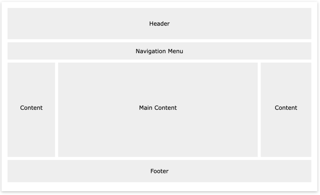
In this exercise, you will finally be moving your elements around on the page and creating your layout. You will get your nav list items horizontal using display: inline. You will float divs on the page to create a more fluid layout. And you will also use position and z:index to fix and overlap things on the page.
Reference the following W3 Schools pages for help:
- W3Schools Video Tutorials (review Box Model, watch Display, Positioning, Float, Horizontal Align, optional: Navigation Bar and Image Gallery)
- Floating Practice on W3Schools
- Website Layout Examples using Float
- Test Positioning at W3Schools
- Box Model
- Display
- Z-index
- Overflow
- Grid View
SETTING UP EXERCISE
1. Clear your margins and padding at the beginning of your CSS document to remove the space around the body which is a browser default. Also add box-sizing:border-box to allow us to include padding and border in all elements’ width and height. Box-Sizing
(css example)
* {
     margin:0;
     padding:0;
     box-sizing:border-box;
}
2. Use ids to style unique elements:
(html example)
<div id="container"></div>
(css example)
#container {

     width: 80%;

     margin: auto;

}
3. Use classes to style repeated elements with the same style:
(html example)<div class="column"></div>
<div class="column"></div>
(css example)
.column {
     float:left;
     width: 45%;
     margin-right: 5%;

}
4. Center the website relative to the browser by putting everything inside the body into a div id with the name container. Set the width and margin using percentages.
(html example)
<div id="container"></div>
(css example)
#container {

     width: 80%;

     margin: auto;

}
5. Make sure you have a header, nav, and footer on your html page and set their width, margins, and padding using percentages in the css document. You may also set their height using pixels if needed.
6. Add other div elements to the html page to further organize content and structure page. You may want to add more content to work with – like photos or text. This will allow you to play with columns. Continue to define width, height, margins, and padding using percentages.
7. Set the width for the img element to 100%, so all the images on your html page will be 100% the width of the divs that they are in.
img {
width: 100%;
height: auto;
}
Additional EXERCISE REQUIREMENTS
The minimum exercise style requirements to style various html elements includes:
DISPLAY
display: inline or display:inline-block(apply to the list items that hold your links in your main nav. this puts things on the same line. the latter also treats them as block elements.) Display
POSITION
position: fixed Position an element so it fixes to the page when scrolling. Could be your nav or header for example or something goofy. Test Positioning at W3Schools
position: relative
Set the outermost #container to relative. Then set another div to position: relative that will contain a few stacked elements that you will position: absolute in the next step.
position: absolute Position at least 2-3 divs using position: absolute so you can overlap them inside your previous div that was position: relative.
SPECIFY POSITION LOCATION
Specify where the positioned elements are on the browser or within a parent element by setting the top or bottom and the left or right position:
top(how many pixels from the top of the browser or parent element)
bottom (how many pixels from the bottom of the browser or parent element)
left (how many pixels from the left of the browser or parent element)
right
(how many pixels from the right of the browser or parent element)
Z-INDEX
z-index (adjust the stacking order of the elements where you used the position property. To bring overlapping elements forward on top of each other, use a number larger than zero.) Z-index
FLOAT
float: left or right Position elements using float. Make sure you indicate the width of your ‘boxes’ and set margins using percentages. Use clear if you need to keep ‘boxes’ from flowing next to a floating element. Website Layout Examples using Float
width (only use %)
height (will probably use pixels for height to be effective. otherwise the box may collapse.)
padding (only use %)
margin (only use %)
clear (choose :both for elements like the footer, so it doesn’t float next to anything else. )
OVERFLOW
overflow (play around with an element’s overflow. auto lets the content dictate the height of the box, scroll adds a scroll bar, and hidden cuts off content that overflows out of the element.) Overflow
OPTIONAL
additional optional styling to better show divisions on your page include border and background-color
SUGGESTIONS
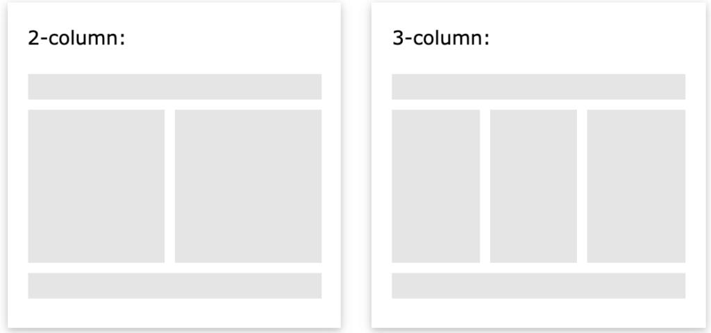
Starting out – don’t mix and match float and position on the same div. Try floating your main sections of content side by side in columns and use position for sticking/overlapping fun elements or things like your nav or footer to the page.
Consider trying a fluid layout like the ones below, with the additional overlapping positioned elements:

